Victoria Rushton spoke about the process of designing her new script face, Gautreaux, at Typographics last year. Afterward, in an email exchange with Stephen Coles, she opened up about a variety of topics: public speaking, education, design, type versus lettering, and diversity.
By Stephen Coles
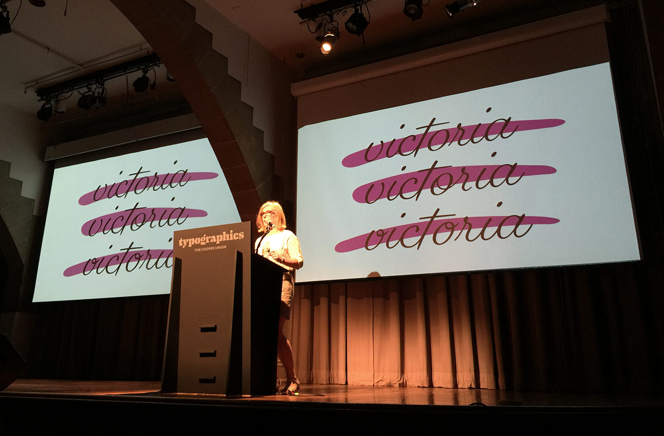
“This was drawn pretty much all digitally, paper slows me down, I’m not sorry.” At Typographics in 2016, Victoria Rushton talked about the process of designing Gautreaux.Stephen Coles: So what was it like speaking at Typographics?
Victoria Rushton: Well, previously, I didn’t have any experience speaking to more than forty people. At Typographics, the whole time, I felt like I had too much air in my lungs that I couldn’t get out, and when I would try to breathe it would catch in the mic, and I felt like that happened constantly. But it went well! I set out to write and speak about a subject that I personally would not be bored by if I were someone else in the audience—and I can get bored pretty easily. People were kind enough not to say “I hated it” to my face, which is really all you can ask.
Gautreaux, Rushton’s new script face, is refreshingly free of bells and whistles.
Coles: You talked about avoiding ligatures and alternates in creating Gautreaux. What led you to take on that challenge?
Rushton: Not wanting to draw ligs and alts. I’d just watched Dai [Foldes, Rushton’s partner] draw—I don’t even remember now—something like four sets of lowercase alphabets for Eubie Script, and finagle an accent builder to make the diacritics for ALL of them (that was a fun night), and it was so much work I just didn’t didn’t feel like going down my own alternates-making rabbit hole. And you’re like, “But Victoria, your way seems like a fair amount of work too. Wasn’t that what your whole spiel was about?” Yeah, sure, yes. But I just wanted to go that way! That’s the neat thing with self-directed projects—you get to make up or choose which problems you want to solve, and that’s the one that called to me right then.
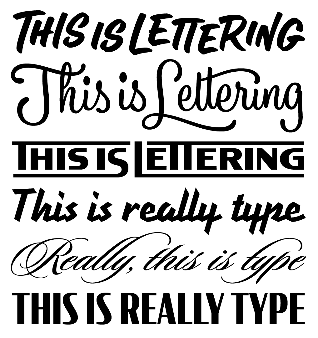
An illustration by Rushton demonstrating the difference between type and lettering. Typefaces shown: Loupot, Sloop, and Condor.Coles: You did a nice job illustrating a piece I wrote a while back on type versus lettering. When should graphic designers look for a lettering artist rather than a font?
Rushton: Oh gosh, I don’t even know! I’m thinking of all these instances where I think it might be the case but you can always come up with exceptions to them. Like, often when you hire a lettering artist (are we allergic to the term letterer? I kinda like it in its clumsy-sounding-ness, like a handful of marbles falling on the ground) it says you have the funds to pay for custom work. And being willing to pay for it means you care about what you’re making, and so we often assume work that has good lettering in it is because the art director cared more. But in tons of instances, people and businesses may care very deeply but just not have the money for custom letters, and a carefully selected and carefully used typeface will serve them just fine. It depends on the circumstances and how much cash you have to blow. I think most of the time when I squint disapprovingly at something and think “That should have been done with lettering,” it’s actually because it’s using a poorly made or unsuited-for-the-work typeface. So you could just as easily think, “That should have been done with a better typeface.” In so many cases it can go either way!
How do you get to be Victoria Rushton? Practice, practice, practice.Coles: How was learning type design in school different from your experience in more of an apprenticeship position?
Rushton: I didn’t learn type design in school, save a single semester elective class my senior year, so it’s been almost all apprenticeship for me—there’s not much to compare. But I definitely wonder what it’d be like to have gone to grad school instead. I have beautiful but who-knows-how-accurate notions of the broader concepts I’d learn and the dazzlingly original work I’d get to make. While I would probably also enjoy learning in an academic or theoretical setting, it’s been great to be thrown into the, y’know, “We’re a business and we gotta get ’er done” setting. It’s not glamorous when maybe all the drawing I have to show for myself in a month is fractions for Poynter Agate or central European accents for Biscotti or a bunch of obsolete currency symbols lovingly kerned to the figures. But I’m extremely grateful to have had people take a chance on my potential and be afforded the opportunity to be taught.
Coles: What kinds of things (that our general readership might understand) have you learned from your colleagues at Font Bureau?
Rushton: So many little things. Mostly that if I think I’m being thorough by double checking something, I should actually be quadruple checking it. At least. Dyana Weissman and Jill Pichotta are on a higher plane of thoroughness that I am only barely able to approach even now, but it’ll get better, I hope. David Berlow taught me that if you start drawing a regular weight typeface, earlyish in the process try to make it as thin as possible and as heavy as possible and see what breaks—and let that help guide how to draw the regular weight. They taught me everything I know, I can’t even say.
Coles: How do you judge typeface quality? When you’re looking at someone else’s work, what is the first thing you look for?
Rushton: Oh gosh, uh. The big ones: it’s fairly obvious to me now when an alphabet doesn’t match itself, or if it’s not spaced very well, or the color looks unintentionally uneven. In scripts sometimes you can tell what the designer wanted something to look like, but they didn’t get the vector placement quite right and it’s a clunky facsimile. Sometimes I check how well different weights relate to each other. Cyrus Highsmith taught me to look at letters as if they are silhouettes of faces (classic Cyrus). To compare, for example, the right side of a light e to a heavy e, and make sure that they look like they’re siblings. They’re different sizes and maybe slightly different proportions, but the curve and shape of each of their foreheads, noses, and chins show they’re clearly related. Sometimes you see light and dark weights of a family where the characters’ contours flatten out, or flex in ways that differ too much from each other as weight gets added on, making them distant cousins instead of siblings, and that’s not great. The only reason I have any sort of grasp on these things is because I’ve messed them all up at some point and redone them.
Coles: What rules can you never break in type design? And do you have plans to break them?
Rushton: Those ones I said in the last question, and anything else like that, I probably wouldn’t break those on purpose. Anything else is fair game.
Coles: How does it feel to be a foundry all of a sudden?
Rushton: People were congratulating me a ton at the conference and I looked at them like they’d grown a second head until they were like, “What?” In all seriousness, though, I’m absolutely thrilled to have this opportunity and for the time my employers are giving me to do self-directed work, but don’t I feel like I have done anything (read: released more than one font) as of yet. With any luck I’ll have a twelve-style text family out this year, and the script not too long after that. Then ask me again! [Embury Text was released in November, 2016; Gautreaux, in May, 2017.—Ed.]
Coles: You’ve been an active member of Alphabettes since its beginning, yes? Talk about that experience. What do you think a community like that does for women in type? Or better, what does it do for type?
Rushton: So in general, in a nutshell: it’s to a company’s or industry’s advantage to build teams and communities that aren’t totally white guys who had similar upbringings and schooling. Even if they’re each really, really good; if you have a homogenous team, that means they approach problems in the same way, and as a group they will get stumped when tackling certain problems, which wouldn’t happen if they were people of different experiences and backgrounds. How good! Now, what this would improve specific to our tiny type industry, I cannot say exactly, but I’m as excited as I hope you are to find out.
I believe it really matters so much that members of any marginalized community have a safer space available within their workplace or industry to connect among themselves, should they want to. In a practical way, it’s a place to form friendships and be able to promote our work to hopefully bring a bigger audience than we could muster on our own. The Alphabettes mentorship program (which Bianca [Berning] is spearheading—kudos to her) is working to expand our reach even further. The playing field is not level, and on days when I’m really feeling the weight of that, it’s necessary to have people who know what you’re talking about say, “I hear you. I see you.”