Typefaces in the Type Network catalog are often decked out with special features and typographic extras. This new series reveals the treasures hidden behind your keyboard.
By Bald Condensed
The versatile Embury Text, Victoria Rushton’s latest release, was used both for body copy and headings in the latest edition of Type Network News. Although this typeface was specifically designed for text, its sturdy characteristics guaranteeing optimal readability at very small sizes, when set big, Embury Text showcases surprisingly nimble curves.
Instead of setting Embury Text out-of-the-box, we tapped into the rich OpenType features that enhance its beauty. While it’s evident that the swash capitals and alternate y, p, and k are integral parts of the family, it’s not entirely obvious that the lovely ornamental border is also included in its character set. Even better: Embury Text offers two different designs for creating sophisticated frames, and both can be easily accessed with Stylistic Sets.
There are two ways to create borders with Embury Text—either by simply typing or by accessing the Glyphs panel. Instead of locating the ornaments in an obscure area of the character set, Rushton took a practical (and user-friendly) approach, assigning the ornaments to logical, easy-to-remember sequences of numbers.
How to build ornamental borders with Embury Text
After typing the desired sequence of numbers, activate Stylistic Set 15 (SS15) or Stylistic Set 16 (SS16) to transform these numbers into border ornaments. The bounding boxes of the ornaments have square proportions.
To achieve the proper vertical spacing of the border elements, make the leading identical to the type size (set solid). The spacing element is the em-space: this character is exactly as wide as the type size, forming a perfect square. Its keyboard shortcut is Shift-Command-M in Adobe InDesign or Command-6 in QuarkXPress.
In Affinity Designer or Affinity Photo, there is no need for a shortcut. Activating SS15 or SS16 automatically transforms the default space character into the required em-space which makes typing borders even easier.
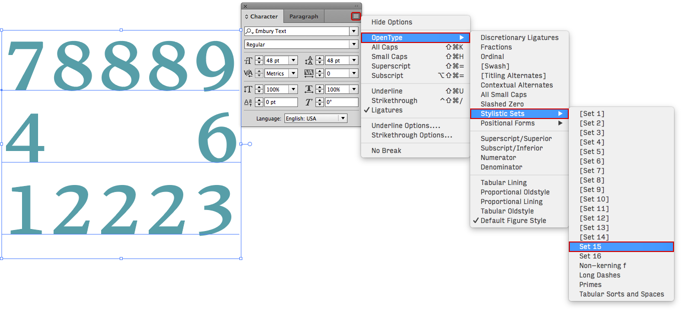
Adobe InDesign CC: Type the desired sequence of numbers, select the text, and activate Stylistic Set 15 (SS15) or Stylistic Set 16 (SS16) to create a decorative border on the fly.
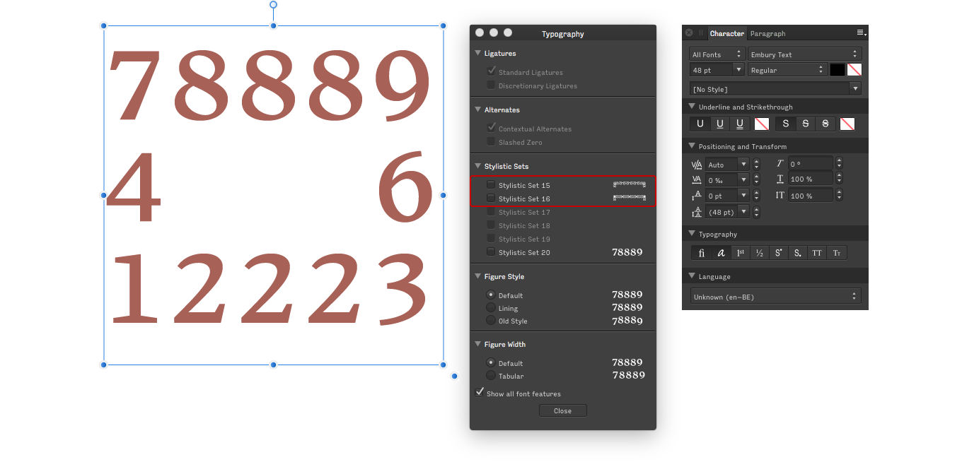
Affinity Designer: The Typography panel previews what the selected text will look like when any given Stylistic Set or other OpenType feature is applied. Activating SS15 or SS16 will transform regular spaces into em-spaces to achieve the proper spacing, so there is no need to memorize key combinations.
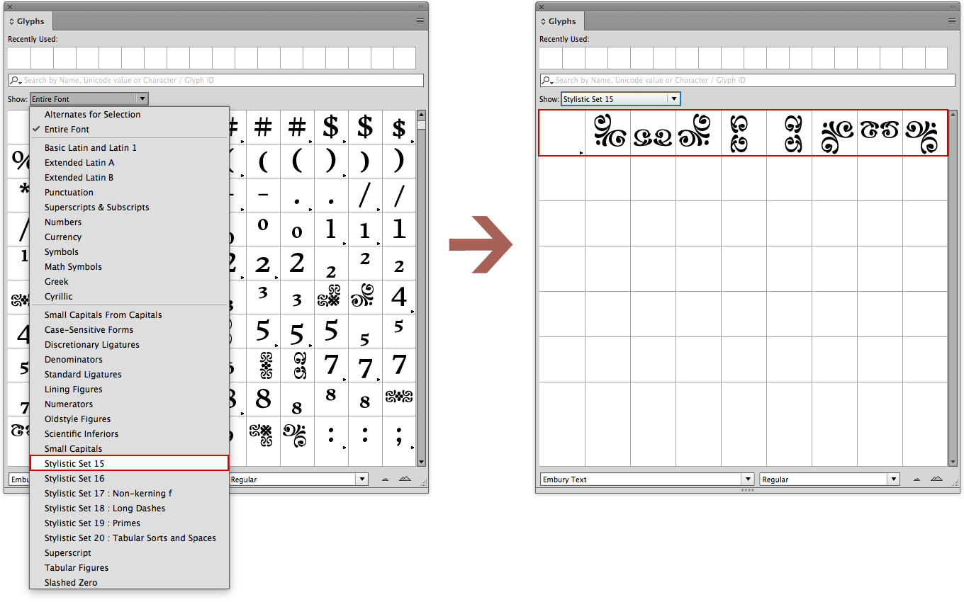
If you are a visual person—or if you are working in Adobe Illustrator or Adobe Photoshop, which don’t yet support Stylistic Sets—use the Glyphs panel to construct your borders.
To quickly view only the desired ornaments rather than having to go through the entire character set, select subset SS15 or SS16 in the Show drop-down menu at the top of the Glyphs panel. Click the proper sequence of ornaments and spacing elements to build the border.
This method also works in Adobe InDesign or QuarkXpress.
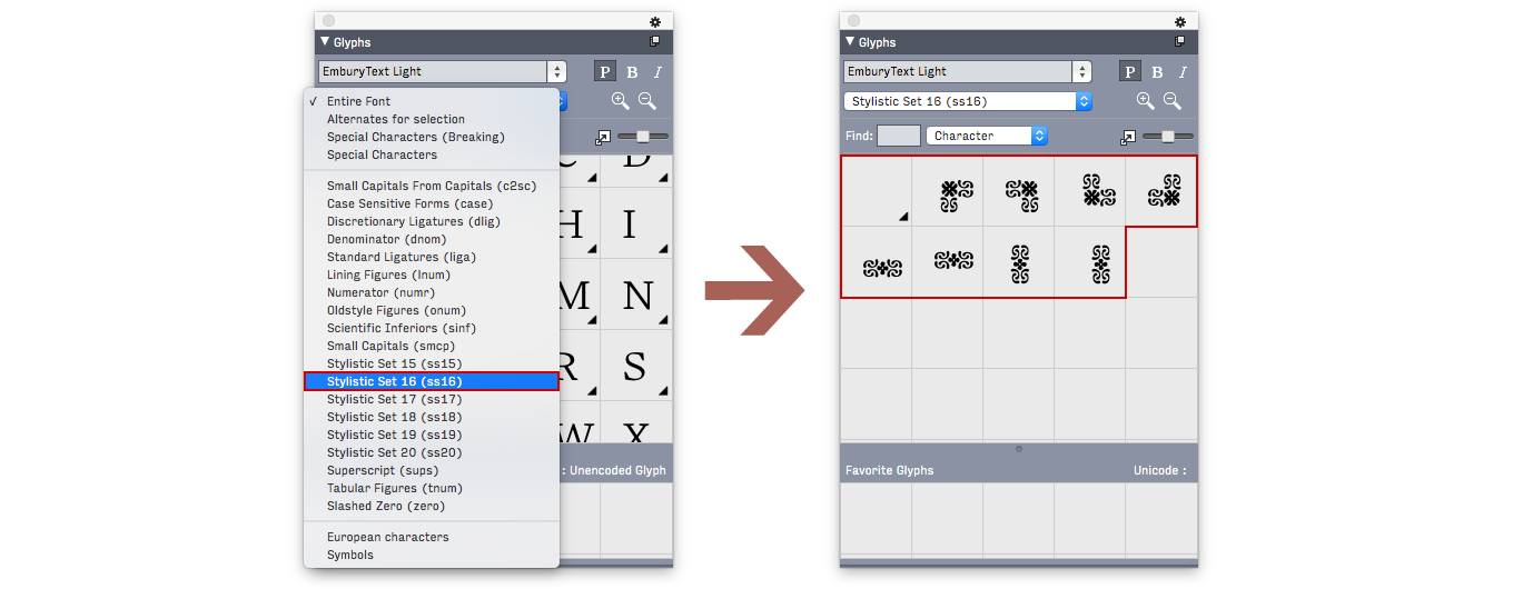
Adobe Illustrator CC: Narrow down the Glyphs palette to the Stylistic Set of your choice for easier access to the border elements.
QuarkXPress: Narrow down the Glyphs palette to the Stylistic Set of your choice for easier access to the border elements.
The ornamental borders are not the only typographic goodies that Rushton included in Embury Text. Open up that Glyphs panel and start exploring to get the most out of this excellent text face.
Bald Condensed, né Yves Peters, is a Belgian-based rock drummer known for his astute observations on the impact of letterforms in the contemporary culture-sphere. A prolific writer on typography, he has a singular knack for identifying the most obscure typefaces known to man.